By BECKY KISER
Hays Post
A single simple organizational logo will “displace the very large amount” of logos currently used by the city of Hays.
“I don’t think any of these logos were adopted by ordinance by the commission in the past,” Toby Dougherty, city manager, told city commissioners Thursday night.
“But because of the staff’s goal to combine them into one logo, we would like you to come to some sort of consensus.”
Dougherty, along with Melissa Dixon, Convention and Visitors executive director, and other city staff members worked with Hays artist Scott Gross who was contracted to design a new logo.
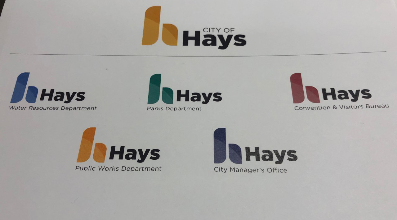
Three similar designs were shown to commissioners who agreed with the staff recommendation of the abstract lowercase “h” option.
Vice-mayor Sean Musil was a little hesitant. “I don’t hate it. I’m just not in love with it,” he said. “I love this logo,” Musil said holding up his bottle of water sporting a current city logo. “To me, this looks fresh.”
 The goal of the logo project was to create a standardized city logo that will work in all type of media, signage, letterhead and even employee clothing. The logo color can be tailored to different departments such as green for parks and blue for water resources.
“The logos that are out there aren’t very organized or cohesive,” said Gross. “It was time to give it an update, give it a nice refresh.”
 Gross, who has also designed logos for several local businesses including Regeena’s Flowers and Gella’s Diner in downtown Hays, showed mockups of the logo on city vehicles, clothing, the blue trash carts and a photo of the iconic Frontier Park bridge.
“The logo looks like it’s two colors but it’s really just one color,” Gross explained. “You’re only spending money on one color when you go to printing on different things. It’s portable. You  can’t really embroider two tones like that so you’re just doing one color, nice and simple.”
The city’s “3 Amigos” logo featuring General George A. Custer, James B. “Wild Bill” Hickok and William “Buffalo Bill” Cody often utilized multiple colors, a more expensive process than a single color.
The new logo will use common Pantone colors and the sans-serif Gotham font.
Gross also showed examples of the logo reversed, in 1-color, gray-scale, and 2-color with a color background.
Some of the logo changes will start immediately.
“All the online electronic stuff, that will happen right away. The stuff we give to the press, the letterhead. All that stuff is going to change quickly,” Dougherty said.
Employee shirts will change as they need to be replaced.
The 50-plus wayfinding signs in Hays may not change. “We may look at it and say keep it. It’s a whole separate entity aside from the organizational logo for the city of Hays.”
Hays Regional Airport has its own logo. The new logo will be adapted, perhaps by adding an airplane, to keep the same organizational theme.
Commissioner Ron Mellick asked if the city was going to “throw away thousands of dollars of letterhead.”
“We buy letterhead in really low amounts,” Dougherty answered, “because commissioners’ names change and we have to redo that letterhead. We buy on an as-needed basis. It’s not like we’re going to toss a lot of stuff into the recycling.” Letterhead will not be changed until after the 2020 commission is seated in January, so there will be no additional cost.
The police and fire departments will also use the updated letterhead. Uniform patches will not be affected and for now, the logo will not be placed on police vehicles. Other city vehicles will get new vinyl decals right away.
The logo committee anticipates the cost to implement the new logo is less than $10,000.
